Plotting in R#
Download Rmd Version#
If you wish to engage with this course content via Rmd, then please click the link below to download the Rmd file.
Learning Objectives#
Learn the basics of creating plots using the
plot()functionUnderstand how to use various arguments such as
xlab,ylab, andcolto customize plotsLearn how to add new data points or lines to existing plots for enhanced visualization
Understand how to adjust plot margins and layout for better presentation
Learn how to create multiple plots in a single window for comparative analysis
Understand how to save and export plots to different file formats
Plots#
The mathematician Richard Hamming once said, “The purpose of computing is insight, not numbers,” and the best way to develop insight is often to visualize data. Visualization deserves an entire lecture (or course) of its own, but we can explore a few of R’s plotting features. R is synonymous with data analysis and visualisation. R is capable of plotting many different types of plots and importantly these are infinitely customisable. To make a plot look the way we want, we need to take advantage of the many arguments available in plotting functions.
The R base function plot() can generate a range of different plots from some user supplied data.
If we provide one vector of continuous data, it plots that on the y-axis against the index on the x-axis.
plot(iris$Sepal.Length)

If we want to plot a scatterplot between two continuous variables, we provide both to the plot() function. The order here can be important, if not explicitly labeled as the x or y variable, R will take the first entry as the x variable and the second entry as the y variable.
plot(iris$Sepal.Length, iris$Sepal.Width)

Alternatively we can use the argument keywords to specify which variable should be plotted on which axis, in this case is doesn’t matter which order we include the arguments. For example we can state the y variable first.
plot(y = iris$Sepal.Length, x = iris$Sepal.Width)

Arguments#
When calling a function, in the case of multiple arguments, there are two ways arguments can be specified. They can be specified positionally, where R knows which argument is which based on the order they are listed, or using keywords where a keyword followed by = is used to inform R which argument is which. With keyword arguments, the order does not matter, with positional arguments it is critical. It is not uncommon to see both ways used within the same function call.
You will see that R has generated the axis labels from the variable names. We can customise this with additional
arguments (xlab and ylab) in the function.
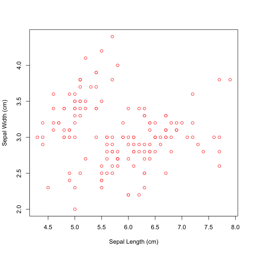
plot(iris$Sepal.Length, iris$Sepal.Width , xlab = "Sepal Length (cm)", ylab = "Sepal Width (cm)")

We can also change the colour of the points with the col argument. If we give it one colour, all the points
will be changed to the same colour.
plot(iris$Sepal.Length, iris$Sepal.Width , xlab = "Sepal Length (cm)", ylab = "Sepal Width (cm)", col = "red")
Alternatively, we can provide a vector of colours, where the first colour will be the colour of the first point drawn, the second colour will be the colour of the second point, and so on. This vector does have to be the same length as the number of points. For example, if we provide a vector of three colours, this will be recycled until all the points have been pointed.
plot(iris$Sepal.Length, iris$Sepal.Width , xlab = "Sepal Length (cm)", ylab = "Sepal Width (cm)", col = c("red", "blue", "#ddaa33"))
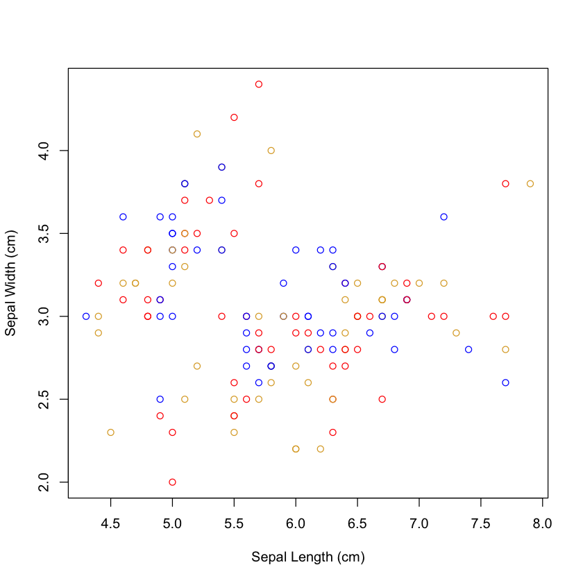
What has happened is the 1st,4th,7th etc are pointed in red, the 2nd,5th,8th etc in blue and the 3rd,6th,9th etc in #ddaa33.
If we want to colour the points by some categorial variable, we can use the fact that factors are represented as integers to subset a vector of colours.
plot(iris$Sepal.Length, iris$Sepal.Width , xlab = "Sepal Length (cm)", ylab = "Sepal Width (cm)", col = c("red", "blue", "#ddaa33")[iris$Species])
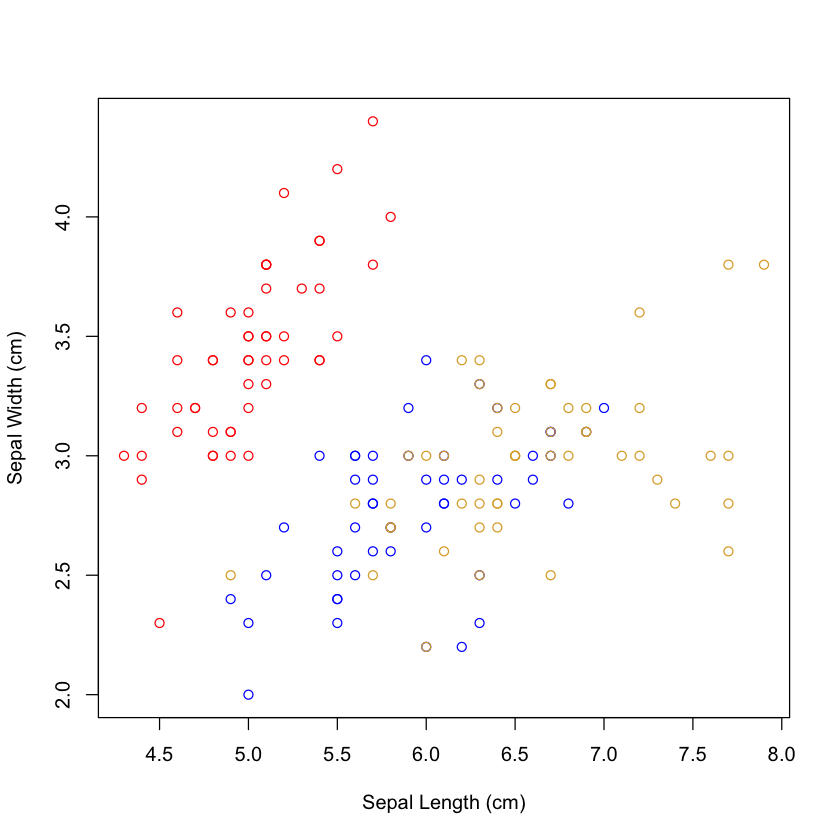
There are three levels in the factor iris$Species, which are represented internally by the numbers 1,2,3. These integers can be used to index a vector of at
least three as shown below, and create a new vector, where each level is replaced by the same colour.
iris$Species[1:10]
- setosa
- setosa
- setosa
- setosa
- setosa
- setosa
- setosa
- setosa
- setosa
- setosa
Levels:
- 'setosa'
- 'versicolor'
- 'virginica'
as.numeric(iris$Species[1:10])
- 1
- 1
- 1
- 1
- 1
- 1
- 1
- 1
- 1
- 1
c("red", "blue", "#ddaa33")[iris$Species[1:10]]
- 'red'
- 'red'
- 'red'
- 'red'
- 'red'
- 'red'
- 'red'
- 'red'
- 'red'
- 'red'
Depending on the data we are attempting to visualize, the type of plot we may want to use will vary. R will automatically try and plot the most appropriate plot for the data provided. Next, we will use a “~” to provide a formula denoting what we want to plot. As iris$Species is a factor, R defaults to a boxplot.
plot(iris$Sepal.Length ~ iris$Species, ylab = "Sepal Length (cm)", xlab = "Species", col = c("red", "blue", "#ddaa33"))
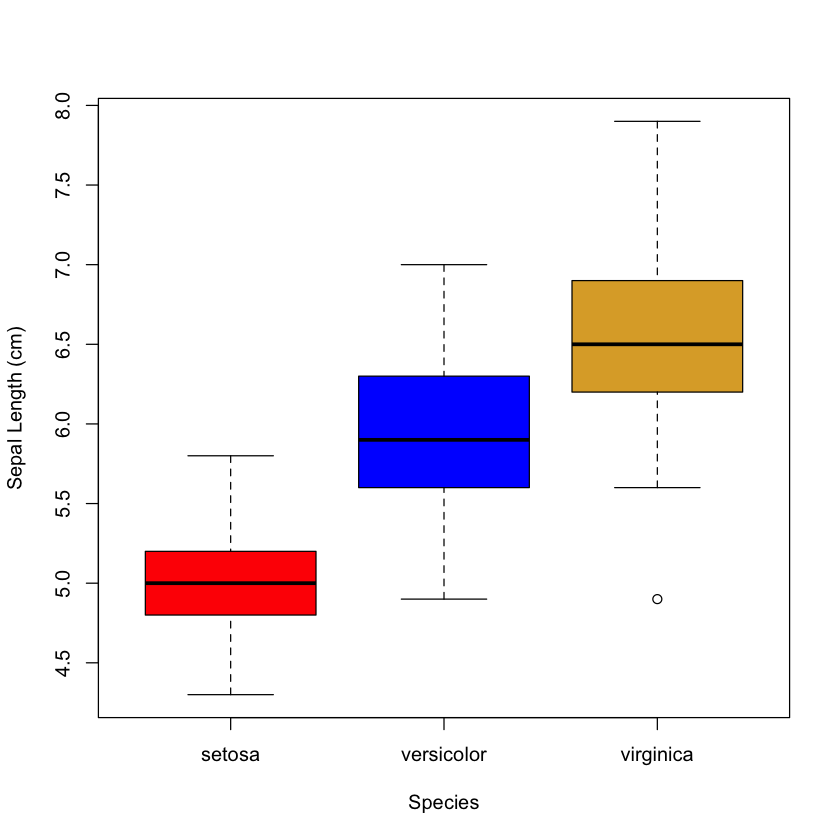
Note here, we only need to provide a vector of three colours, as there are only three boxes in the figure.
As well as the plot() function, R has some specific plot functions (box plots (boxplot()), histograms (hist())
and bar plots (barplot())) we can call instead. These functions use a lot of the same arguments to customise
the appearance of the plot.
For example, we can recreate the same boxplot as follows:
boxplot(iris$Sepal.Length ~ iris$Species, ylab = "Sepal Length (cm)", xlab = "Species",
     col =  c("red", "blue", "#ddaa33"))
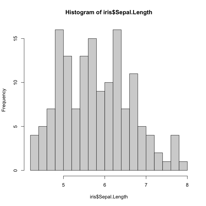
Histograms are plotted using the function hist(), which allows us to plot the frequency distribution of a vector.
You can use standard plotting arguments such as col, but we can also use the argument breaks to adjust the amount of bins.
# Plotting "Sepal.Length" with increased bins
hist(iris$Sepal.Length, breaks = 16)
Below you can see a table containing a lot of basic plotting arguments. Also, for colour selection, making colour themes and looking for colour blind options, you can use https://www.colorhexa.com/ which will give you R friendly colour codes.
Argument |
Description |
Example |
|---|---|---|
bg |
The color to be used for the background |
bg = “blue” |
cex |
Character size and expansion |
cex = 1.5, cex = 0.8 |
cex.axis |
The magnification to be used for axis annotation |
cex.axis = 1.2 |
cex.lab |
The magnification to be used for x and y label |
cex.lab = 0.8 |
cex.main |
The magnification to be used for main titles |
cex.main = 1.3 |
cex.sub |
The magnification to be used for sub-titles |
cex.sub = 0.9 |
col |
Colour |
col = “red”, col = “#ff0000” |
family |
Font on the plot |
family = “Arial” |
fg |
The colour to be used for the foreground of plots |
fg = “orange” |
font |
An integer which specifies which font to use for text. Italic, bold etc. |
font = 3 |
font.axis |
The font to be used for axis annotation |
font.axis = 2 |
font.lab |
The font to be used for x and y labels |
font.lab = 3 |
font.main |
The font to be used for plot main titles |
font.main = 2 |
font.sub |
The font to be used for plot sub-titles |
font.sub = 2 |
lty |
Line type |
lty = 2 |
lwd |
Line width |
lwd = 3 |
main |
Plot primary title |
main = “Iris” |
pch |
Scatter plot symbol for points |
pch = 1, pch= “p” |
srt |
The string rotation in degrees |
srt = 90 |
sub |
Subtitle of plot |
sub = “All data” |
xlab, ylab |
Label of the x or y axis |
xlab = “Distance (Miles)” |
xlim, ylim |
Min/max x or y axis values |
xlim = c(0, 10) |
xpd |
If true, allows plotting outside the plot |
xpd = TRUE |
Adding data to an existing plot#
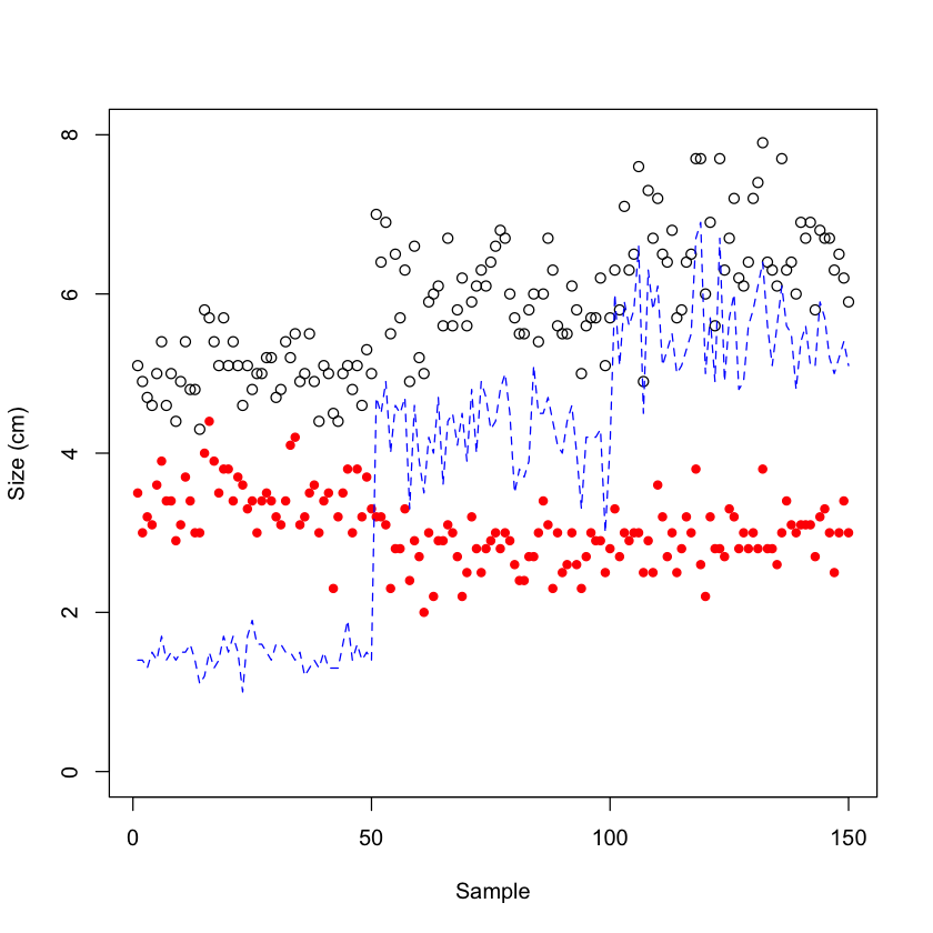
Once you have created a plot, there are various methods which allow us to add more data on top. For example, we may want to add individual data points on top of a boxplot, add more data points to a plot or add a line. To do this we can use functions such as points(), lines() or abline().
Using points() and lines(), you can add more data to your plot. They use similar arguments to plot(),
such as col, lty, pch, cex etc.
# Plot "Sepal.Length" on a, then add "Sepal.Width" data as points and "Petal.Length" as lines
plot(iris$Sepal.Length, ylim = c(0, 8), ylab = "Size (cm)", xlab = "Sample")
points(iris$Sepal.Width, col = "red", pch = 19, cex = 0.8)
lines(iris$Petal.Length, lty = 2, col = "blue")
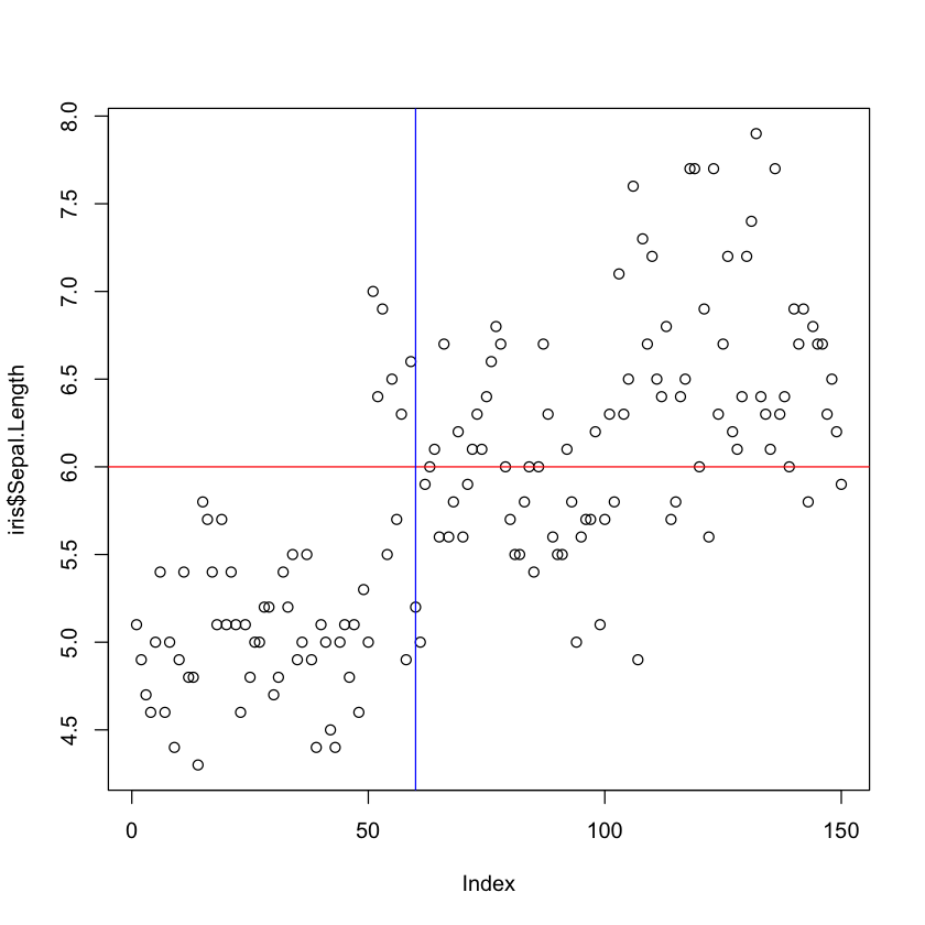
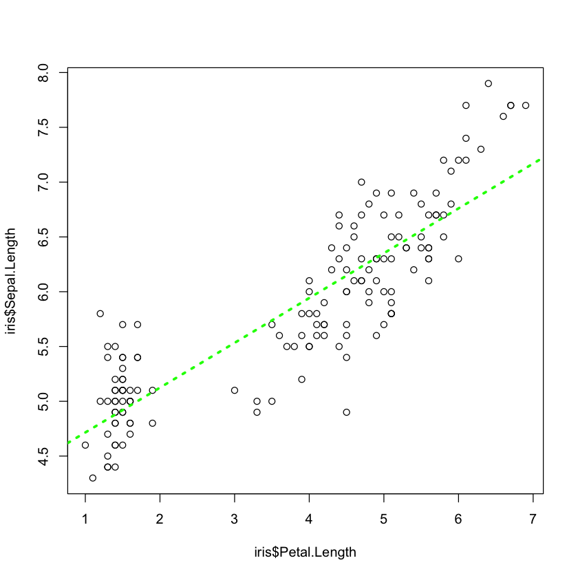
Using abline(), you can add horizontal lines (h=), vertical lines (v=), or diagonal lines(x, y). You can also specify the parameters of the straight line i.e the intercept (a=) and slope coefficient (b=). It can also be wrapped around a linear regression (lm()) to add a line of best fit.
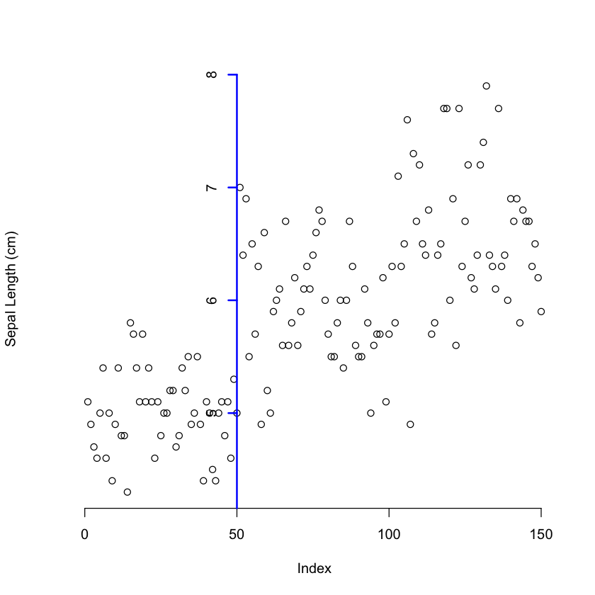
# Adding a horizontal line at 6 and a vertical line at 60
plot(iris$Sepal.Length)
abline(h = 6, col = "red")
abline(v = 60, col = "blue")
# Plotting "Sepal.Length" against "Petal.Length" and adding a line of best fit
plot(iris$Sepal.Length ~ iris$Petal.Length)
abline(lm(iris$Sepal.Length ~ iris$Petal.Length), lty = 3, col = "green", lwd = 3)
Further customisations#
We can make many additions to our plots. As there are so many, we will only explore the most common ones here but will list additional ones which may be useful in the future.
We often need to add a legend to our visualisation, and can do this using legend(). The legend() function allows us to
define position, either by using x, y coordinates or by a word such as “topleft”. We also provide the text, colours
and background.
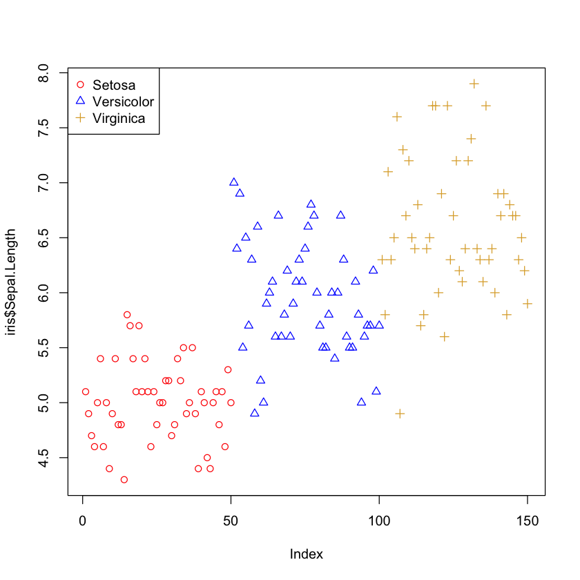
# Plotting "Sepal.Length" and colouring and using different points by "Species", then adding a legend
plot(iris$Sepal.Length, col = c("red", "blue", "#ddaa33")[iris$Species],
     pch = c(1, 2, 3)[iris$Species])
legend("topleft", legend = c("Setosa", "Versicolor", "Virginica"),
       pch = c(1,2,3), col = c("red", "blue", "#ddaa33"))
We can add additional text to a plot by using text() or mtext() for putting text in the margin. To use
text(), we provide x, y coordinates,
the text to be written (labels =), size (cex =), and colour (col =) and font (font =).
Using mtext() requires different arguments as it is in relation to the margin side we put the text in. It requires
the text (text = ), the side of the plot
the text will go in (side =) with 1 = bottom, 2 = left, 3 = top, 4 = right, and the margin line to put the text on (line = ).
# Adding text to a plot
plot(iris$Sepal.Length)
text(20, 6, "text", cex = 0.7, col = "blue", font = 2)
mtext("text", side = 4, line = 1, col = "red")

There are times when we may want to add additional axes or move and adjust the axes of a plot. For this, we use
an axis() function after we create our plot. But first we need to tell R not to plot the default axes by
setting the argument axes to FALSE when running plot(). axis() can be used to plot one axis at a time.
Arguments for axis() include:
stating which side you want the axis to be drawn
(side =)where 1 = below, 2 = left, 3 = above and 4 = rightthe positions the tick-marks are drawn
(at =)what the labels are
(labels =)how far from the axis the ticks should extend
(line =)the position of the axis
(pos =),and if tick marks should be drawn
(tick =). You can also change the line width(lwd =), colour(col =)and type of line(lty =). You need to useaxis()for each axis you want to add.
# Plotting "Sepal.Length" without axes and adding them with adjustment
plot(iris$Sepal.Length, axes = F, ylab="Sepal Length (cm)")
axis(1)
axis(2, pos = 50, at = 1:8, lwd = 2, col = "blue")
If you want to enclose the plot in a box (i.e. add in the extra axes as straight lines) you can use the function box().
Additional functions to add elements to your plots are segments(), arrows(), curve(), rect(),
polygon() and grid().
Adjusting the plot margins#
There are times when you want to adjust the size of the margins of a plot to make better use of the space available.
Using par() with mar() and/or mgp() before calling plot(), we can adjust the margins of our plot.
The function par() is essentially the function to set the parameters of the plots that follow. We can use it multiple times in
a script to change the appearance of different plots.
Using the argument mar allows us to adjust the width of the margins on each side of the plot. They are specificed in the unit of
lines, with the default being c(5, 4, 4, 2) + 0.1 relating to bottom, left, top and right respectively.
As the mar() function just changes the width of the margins, anything located outside of the new sized margins
is just pushed outside of the plotting region. For this reason we may also need to adjust the elements in the margin
so we don’t just loose them or have them partly cut off. Using mgp() sets the axis label locations relative to
the edge of the inner plot window. It takes a vector of length 3 where, the first value represents the location of
the axis label, the second value represents the position of the tick-mark labels, and the third value represents the position of the tick marks.
The default is c(3, 1, 0).
The argument las() allows us to specify the orientation of the tick mark labels or any other text added to a plot.
The options are parallel to the axis (the default, las = 0), always horizontal (las = 1), always perpendicular to the
axis (las = 2), and always vertical (las = 3). It can also be used within the axis() or text()
functions to change the orientation of specific elements.
par(mar = c(4, 4, 2, 1), mgp = c(2, 0.5, 0), las = 1)
plot(iris$Sepal.Length, ylab="Sepal Length (cm)")

Creating composite plots#
There are two options for making composite plots, or a multi-panel plot.
We can use the par() function with the arguments mfrow mfcol which allows us to define a matrix of plots
with a specified number of rows and columns. Using mfcol draws by columns and mfrow draws by rows.
par(mar = c(4, 4, 2, 1))
par(mfrow = c(1, 2))
plot(iris$Sepal.Length, ylab="Sepal Length (cm)")
plot(iris$Sepal.Width, ylab="Sepal Width (cm)")

Alternatively we can use the function layout() which allows for complicated ways of combining plots. Again you should think of it as a matrix or grid but in this case a plot can occupy multiple elements. In this way plots can be different sizes.
The relevant argument is matrix where you need to provide a matrix with increasing integers specifying where you want each plot
to be located.
For example, if we want a plot with three figures, where one figure occupies the top, and there are two figures underneath,
we need a 2x2 matrix with 1s across the top and 2 and 3 underneath. We can create a matrix with the function matrix()
where we provide the elements as a vector and the number of rows (or columns or both). The byrow argument, if true,
will add the numbers to the matrix by row; if FALSE, it will add by column.
m <- matrix(c(1, 1, 2, 3), nrow = 2, ncol = 2, byrow = TRUE)

print(m)
     [,1] [,2]
[1,]    1    1
[2,]    2    3
If we provide this matrix to the layout() function, we are telling it to put the first plot to the positions
occupied with the value 1, the second plot where the value 2 is located, and the third plot where the value 3 is located.
par(mar = c(4, 4, 2, 1))
layout(matrix(c(1, 1, 2, 3), 2, 2, byrow = TRUE))
plot(iris$Sepal.Length, ylab = "Sepal Length (cm)")
plot(iris$Sepal.Width, ylab = "Sepal Width (cm)")
plot(iris$Petal.Length, ylab = "Petal Length (cm)")

Saving and exporting plots#
We can save our plots in various file formats by using the appropriate function. These include as a pdf (pdf()),
jpeg (jpeg()), png (png()) or tiff (tiff()). These functions, with their arguments, need to be called
before the plot is created (in order to open the connection to the file), and then the connection needs to be closed
by executing dev.off(). The first argument for all of these functions is the path and/or file name where you want
to save the plot. When you call these functions, you can also define the size of the image (using the arguments width,
height, units), the background colour bg and resolution res. If the file does not exist, it will be
created. If it already exists, it will be overwritten without warning. All of these functions apart from pdf()
will only save one image (although this could be a multi-panel plot), and the last image that is plotted before dev.off()
is called. pdf() on the other hand will save multiple images as multiple pages.
# Saving a plot as a jpeg file
jpeg("images/exampleplot.jpg", width = 300, height = 300, units = "mm", bg = "white", res = 200)
plot(iris$Sepal.Length, ylab = "Sepal Length (cm)")
dev.off()
Activity:#
Make two objects, one object containing values 1-20, and another object containing values 40-21
Using your objects, create a plot with the object containing 1:20 on the x-axis and the object containing 40-21 on the y-axis
Change the x-axis label to “Independent Variable” and y-axis label to “Dependent Variable”
Expand both axes to show values 1-40
Increase the data point size, change their style and make them repeat between five colours
Add a legend to the top right of the plot showing the five colours you have chosen and labelling them A, B, C, D, and E
Add a horizontal line at 30; choose a colour, weight and style
Add a vertical line at 10; choose a different colour, weight and style
Add text saying “Cross Point” to the top right of the intersection of the two lines. Adjust the colour and size.
Using “iris”, create a scatter plot with “Sepal.Length” on the x-axis, labelled “Sepal length (cm)”, and the other three variables plotted on the y-axis, with the label being “Size (cm)”
Colour the three species differently and make the three measures different point styles
Add a legend to show all the groups, and make sure it doesn’t cover any points
Make sure the x-axis limits are 0-8 and y-axis limit is 4-8
Adjust the margins to give a larger space around the edge of the plot and move the axis labels a little away from the axes
Export the image as a pdf
Create a composite plot with the following panels using “iris”. Make the plots colourful and variable. Ensure that all points are visible in the plotting window and that axes have labels and measurement units. Export the plot as a high resolution (200) jpeg. Make sure the points and text are readable, and all info is visible. You may need to adjust margins
Box plot of “Petal.Length” by species coloured by species
Histogram of “Petal.Length” with 6 breaks, each one coloured differently, with a line added for the mean, coloured and labelled “Mean = X” where “X” is the mean value. Make this panel take more space
“Petal.Length” against “Petal.Width” for just “virginica” species, with a line of best fit (hint: subsetting)