How to Embed Python Code in Markdown#
Learning Objectives#
By the end of this section, you will be able to:
Understand how to embed Python code within a Markdown document.
Learn how to use Jupyter Notebooks to create dynamic and interactive documents.
Explore techniques for running and displaying Python code outputs directly in Markdown.
Key Points#
In Jupyter Notebooks, you can mix Markdown (for text) and code (for Python).
This lets you create readable documents with explanations, code, and output all in one place.
1. Create a Jupyter Notebook file#
In the JupyterLab interface, click the File menu at the top left.
Choose
New > Notebookfrom the drop-down.Select
Python 3as the kernel (this allows you to run Python code in the notebook).
2. Jupyter Notebook Basics#
A Jupyter Notebook consists of different types of cells that you can use to create interactive documents. The two most commonly used cell types are:
Markdown cells
Code cells.
Add Markdown#
You can write Markdown in a cell and then render it by executing the cell.
Click on a cell to select it.
Ensure the cell is set to
Markdown:Look at the toolbar at the top of the JupyterLab interface.
In the dropdown menu, you’ll see the option to select the
Cell Type. If the cell is not already set toMarkdown, click the dropdown and selectMarkdown.Alternatively, you can simply press the
Mkey when the cell is selected, which will automatically set the cell toMarkdown.
Enter your text and use Markdown syntax for formatting.
## Results
After entering the code, you can execute the cell by pressing Shift + Enter or the single arrow at the top. The output will be displayed below the cell.
Add Python#
Click on the cell below to select it
Ensure the cell is set to
Code:Look at the toolbar at the top of the JupyterLab interface.
In the dropdown menu, you’ll see the option to select the
Cell Type. If the cell is not already set toCode, click the dropdown and selectCode.Alternatively, you can simply press the
Ykey when the cell is selected, which will automatically set the cell to Code.
Type a Python command, such as:
4 * 4
After entering the code, you can execute the cell by pressing Shift + Enter or the single arrow at the top. The output will be displayed below the cell.
Every time code is executed in a code cell, the output will be shown directly below the cell.
Outputs can include:
Text (e.g., print statements)
Plots (using libraries like matplotlib or seaborn)
Tables (using pandas DataFrames)
You can edit an already executed cell, double-click the cell or press Enter while it’s selected.
Remember: if the code is changed, the output will update instantly when the cell is re-executed.
3. Packages#
Importing packages into a Jupyter notebook is a crucial step, exactly like importing them in a regular Python .py file. For example:
import pandas as pd
Importing packages will give you access to external libraries like pandas, numpy or matplotlib. You may see an error when importing a package, this usually means the package isn’t installed yet.
Error Package Not Installed
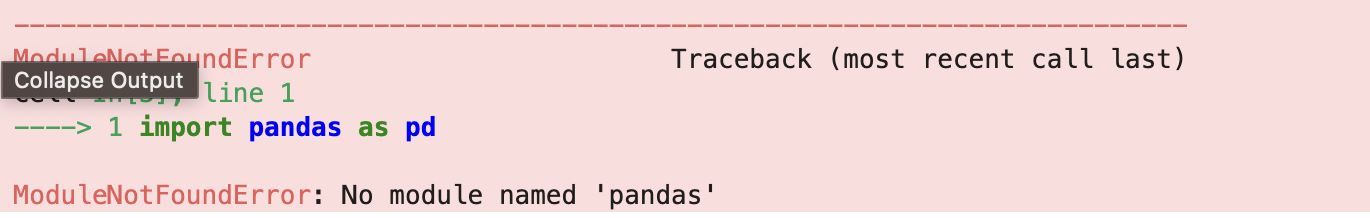
Solution
Install package
in Jupyter Notebook:
!pip install pandasin a terminal:
pip install pandas
4. Import Data#
Now, you’ll learn how to load and explore real data using pandas DataFrames, an essential skill when working with dynamic documents in Jupyter Notebooks.
We’ll be using the Titanic dataset, a classic dataset that contains information about passengers on the Titanic, such as age, class, sex, and whether they survived. This dataset is built into the seaborn library, so there’s no need to download anything manually.
We first want to import the packages and load the dataset. A Jupyter notebook cell can take multiple lines so we will put the following in one cell:
import seaborn as sns
import pandas as pd

df = sns.load_dataset("titanic")
Don’t forget to install the packages!
This creates a pandas data frame named df that we’ll use for the rest of the lesson.
Let’s inspect the data!
Let’s start by viewing the first 5 rows:
df.head()
Once you have executed the cell (Shift + Enter), you will see the output table below your python command.
Similarly, we can get a summary of columns and data types:
df.info()
Finally, we’ll see the basic stats for the numeric columns:
df.describe()
To load a dataset from your local machine (e.g. a .csv file), you can use pandas.read_csv(). Here’s an example:
import pandas as pd

df = pd.read_csv("path/to/data.csv")
You can then use df.head() to preview the dataset, just as you would with built-in data.
For this lesson, we’ll continue using a dataset provided by the seaborn library to keep things simple and avoid the need for local file uploads.
5. Graphs#
In this section, you’ll learn how to create simple, static graphs to explore and communicate insights from your data. We’ll use the Titanic dataset and Matplotlib. We have already imported the dataset so now we just need to import Matplotlib.
import matplotlib.pyplot as plt
Histogram#
We can view Age Distribution using a histogram.
plt.hist(df["age"].dropna(), bins=30)
plt.title("Age Distribution")
plt.xlabel("Age")
plt.ylabel("Frequency")
plt.show()
Barchart#
We can analyse survival counts using a barchart.
survival_counts = df["survived"].value_counts()

plt.bar(survival_counts.index.astype(str), survival_counts.values)
plt.title("Survival Counts")
plt.xlabel("Survived (0 = No, 1 = Yes)")
plt.ylabel("Number of Passengers")
plt.show()
Remember!
You can always tweak plots using matplotlib functions after creating a seaborn plot, such as adding labels, titles, or rotating tick labels for clarity.
5. Beyond Static Graphs#
While static graphs created with Matplotlib or Seaborn are excellent for basic visualisation, they can be limited when you want to explore data more deeply or share your findings in an engaging way.
Interactive graphs allow users to:
Zoom in and out to examine details closely.
Hover over points to see exact values or additional information.
Pan around the plot dynamically.
Filter or select data on the fly.
These features make your analysis more flexible and insightful, especially for large or complex datasets.
There is a very useful interactive ploting library called plotly which can help with this.
What it is: A powerful library for interactive, web-based visualisations.
Key features: Zooming, panning, tooltips on hover, multiple chart types, easy sharing as HTML.
Example: Creating an interactive scatter plot where users can explore data points by zooming or hovering.
Here is an example using plotly to plot a scatter graph of Fare vs Age.
import plotly.express as px

fig = px.scatter(df, x="age", y="fare", color="class",
                 hover_data=["sex", "survived"],
                 title="Interactive Scatter Plot of Fare vs Age")
fig.show()
Once you have executed this in a cell and the graph is displayed, have a play with the interactive features. You’ll be able to toggle the key on and off, select data points for more information, and zoom in and out. A tool bar appears when you hover over the graph which aids interaction.
Embedding Python in Markdown transforms static documents into interactive, dynamic tools that enhance data analysis, storytelling, and reproducibility.
Notes on Sensitive Data#
Before sharing or publishing your notebooks, ensure they do not contain any sensitive or restricted information. This includes:
Personal identifiers (e.g. names, addresses, NHS numbers).
Confidential research data.
For example, data from resources like the UK Biobank is highly restricted and governed by strict usage agreements, you must:
Not share raw data outside approved channels.
Avoid including any identifying variables in notebooks.
Remove or anonymise data used in code examples.
Use mock data or publicly available datasets for demonstrations, and always follow your institution’s or organisation’s data protection and ethical guidelines.