

Creating Histograms#
Questions
How can we create grayscale and colour histograms to understand the distribution of colour values in an image?
Objectives
Explain what a histogram is.
Load an image in grayscale format.
Create and display grayscale and colour histograms for entire images.
Create and display grayscale and colour histograms for certain areas of images, via masks.
In this episode, we will learn how to use scikit-image functions to create and display histograms for images.
First, import the packages needed for this episode
import imageio.v3 as iio
import ipympl
import matplotlib.pyplot as plt
import numpy as np
import skimage as ski

%matplotlib widget
Introduction to Histograms#
As it pertains to images, a histogram is a graphical representation showing how frequently various colour values occur in the image. We saw in the Image Basics episode that we could use a histogram to visualise the differences in uncompressed and compressed image formats. If your project involves detecting colour changes between images, histograms will prove to be very useful, and histograms are also quite handy as a preparatory step before performing thresholding.
Grayscale Histograms#
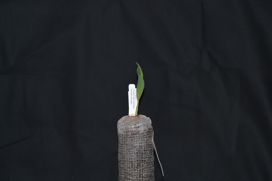
We will start with grayscale images, and then move on to colour images. We will use this image of a plant seedling as an example:
Here we load the image in grayscale instead of full colour, and display it:
# read the image of a plant seedling as grayscale from the outset
plant_seedling = iio.imread(uri="data/plant-seedling.jpg", mode="L")

# convert the image to float dtype with a value range from 0 to 1
plant_seedling = ski.util.img_as_float(plant_seedling)

# display the image
fig, ax = plt.subplots()
ax.imshow(plant_seedling, cmap="gray")
<matplotlib.image.AxesImage at 0x7fc34cdd40d0>
Again, we use the iio.imread() function to load our image.
Then, we convert the grayscale image of integer dtype, with 0-255 range, into
a floating-point one with 0-1 range, by calling the function
ski.util.img_as_float. We can also calculate histograms for 8 bit images as we will see in the
subsequent exercises.
We now use the function np.histogram to compute the histogram of our image
which, after all, is a NumPy array:
# create the histogram
histogram, bin_edges = np.histogram(plant_seedling, bins=256, range=(0, 1))
The parameter bins determines the number of “bins” to use for the histogram.
We pass in 256 because we want to see the pixel count for each of
the 256 possible values in the grayscale image.
The parameter range is the range of values each of the pixels in the image can have.
Here, we pass 0 and 1,
which is the value range of our input image after conversion to floating-point.
The first output of the np.histogram function is a one-dimensional NumPy array,
with 256 rows and one column,
representing the number of pixels with the intensity value corresponding to the index.
I.e., the first number in the array is
the number of pixels found with intensity value 0,
and the final number in the array is
the number of pixels found with intensity value 255.
The second output of np.histogram is
an array with the bin edges and one column and 257 rows
(one more than the histogram itself).
There are no gaps between the bins, which means that the end of the first bin,
is the start of the second and so on.
For the last bin, the array also has to contain the stop,
so it has one more element, than the histogram.
Next, we turn our attention to displaying the histogram, by taking advantage of the plotting facilities of the Matplotlib library.
# configure and draw the histogram figure
fig, ax = plt.subplots()
ax.set_title("Grayscale Histogram")
ax.set_xlabel("grayscale value")
ax.set_ylabel("pixel count")
ax.set_xlim([0.0, 1.0])  # <- named arguments do not work here

ax.plot(bin_edges[0:-1], histogram)  # <- or here
[<matplotlib.lines.Line2D at 0x7fc34cc89a90>]
We create the plot with plt.subplots(),
then label the figure and the coordinate axes with ax.set_title(),
ax.set_xlabel(), and ax.set_ylabel() functions.
The last step in the preparation of the figure is to
set the limits on the values on the x-axis with
the ax.set_xlim([0.0, 1.0]) function call.
Variable-length argument lists
Note that we cannot used named parameters for the
ax.set_xlim() or ax.plot() functions.
This is because these functions are defined to take an arbitrary number of
unnamed arguments.
The designers wrote the functions this way because they are very versatile,
and creating named parameters for all of the possible ways to use them
would be complicated.
Finally, we create the histogram plot itself with
ax.plot(bin_edges[0:-1], histogram).
We use the left bin edges as x-positions for the histogram values by
indexing the bin_edges array to ignore the last value
(the right edge of the last bin).
Histograms in Matplotlib
Matplotlib provides a dedicated function to compute and display histograms:
ax.hist().
We will not use it in this lesson in order to understand how to
calculate histograms in more detail.
In practice, it is a good idea to use this function,
because it visualises histograms more appropriately than ax.plot().
Here, you could use it by calling
ax.hist(image.flatten(), bins=256, range=(0, 1))
instead of
np.histogram() and ax.plot()
(*.flatten() is a NumPy function that converts our two-dimensional
image into a one-dimensional array).
Exercise: Using a mask for a histogram (15 min)#
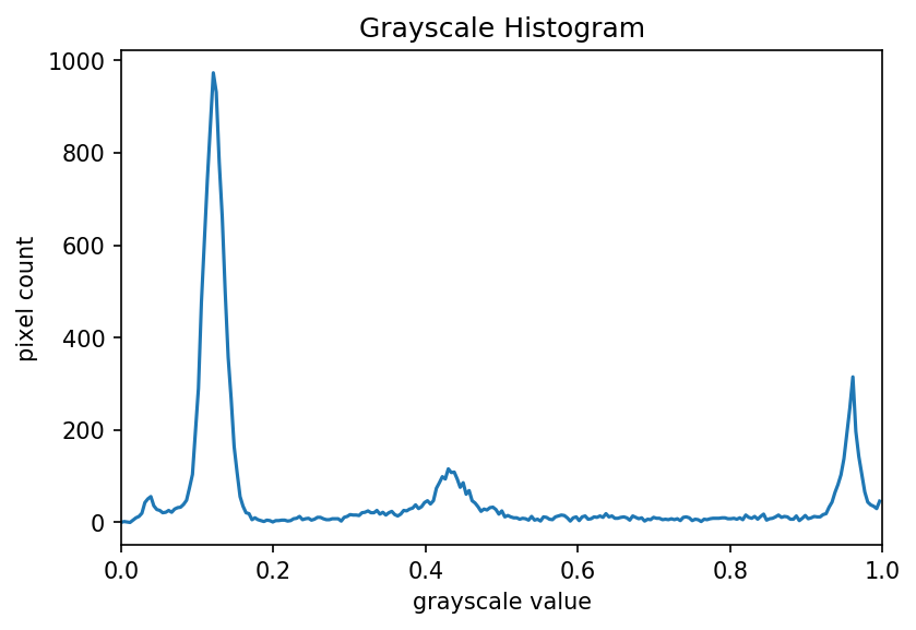
Looking at the histogram above, you will notice that there is a large number of very dark pixels, as indicated in the chart by the spike around the grayscale value 0.12. That is not so surprising, since the original image is mostly black background. What if we want to focus more closely on the leaf of the seedling? That is where a mask enters the picture!
First, hover over the plant seedling image with your mouse to determine the (x, y) coordinates of a bounding box around the leaf of the seedling. Then, using techniques from the Drawing and Bitwise Operations episode, create a mask with a white rectangle covering that bounding box.
After you have created the mask, apply it to the input image before passing
it to the np.histogram function.
Solution
# read the image as grayscale from the outset
plant_seedling = iio.imread(uri="data/plant-seedling.jpg", mode="L")

# convert the image to float dtype with a value range from 0 to 1
plant_seedling = ski.util.img_as_float(plant_seedling)

# display the image
fig, ax = plt.subplots()
ax.imshow(plant_seedling, cmap="gray")

# create mask here, using np.zeros() and ski.draw.rectangle()
mask = np.zeros(shape=plant_seedling.shape, dtype="bool")
rr, cc = ski.draw.rectangle(start=(199, 410), end=(384, 485))
mask[rr, cc] = True

# display the mask
fig, ax = plt.subplots()
ax.imshow(mask, cmap="gray")

# mask the image and create the new histogram
histogram, bin_edges = np.histogram(plant_seedling[mask], bins=256, range=(0.0, 1.0))

# configure and draw the histogram figure
fig, ax = plt.subplots()

ax.set_title("Grayscale Histogram")
ax.set_xlabel("grayscale value")
ax.set_ylabel("pixel count")
ax.set_xlim([0.0, 1.0])
ax.plot(bin_edges[0:-1], histogram)
Your histogram of the masked area should look something like this:
Colour Histograms#
We can also create histograms for full colour images, in addition to grayscale histograms. We have seen colour histograms before, in the Image Basics episode. A program to create colour histograms starts in a familiar way:
# read original image, in full color
plant_seedling = iio.imread(uri="data/plant-seedling.jpg")

# display the image
fig, ax = plt.subplots()
ax.imshow(plant_seedling)
<matplotlib.image.AxesImage at 0x7fc34cc0fad0>
We read the original image, now in full colour, and display it.
Next, we create the histogram.
Since we have a colour image,
we use np.histogram three times,
once for each of the channels (red, green, blue).
We use a for loop to do this,
which is a common Python programming pattern.
To produce the colours in the histogram plot,
we use a tuple variable called colors:
colors = ("red", "green", "blue")
This specifies that the line for the red channel should be coloured red, the green channel line should be green, and the blue channel line should be blue.
# tuple to select colors of each channel line
colors = ("red", "green", "blue")

# create the histogram plot, with three lines, one for each color
fig, ax = plt.subplots()
ax.set_xlim([0, 256])
for channel_id, color in enumerate(colors):
    histogram, bin_edges = np.histogram(
        plant_seedling[:, :, channel_id], bins=256, range=(0, 256)
    )
    ax.plot(bin_edges[0:-1], histogram, color=color)

ax.set_title("Color Histogram")
ax.set_xlabel("Color value")
ax.set_ylabel("Pixel count")
Text(0, 0.5, 'Pixel count')
We will draw the histogram line for each channel in a different colour, and so we create a tuple of the colours to use for the three lines with the
colors = ("red", "green", "blue")
line of code.
Then, we limit the range of the x-axis with the ax.set_xlim() function call.
Next, we use the for control structure to iterate through the three channels,
plotting an appropriately-coloured histogram line for each.
This may be new Python syntax for you,
so we will take a moment to discuss what is happening in the for statement.
The Python built-in enumerate() function takes a list and returns an
iterator of tuples, where the first element of the tuple is the index and the second element is the element of the list.
Iterators, tuples, and enumerate()
In Python, an iterator, or an iterable object, is
something that can be iterated over with the for control structure.
A tuple is a sequence of objects, just like a list.
However, a tuple cannot be changed,
and a tuple is indicated by parentheses instead of square brackets.
The enumerate() function takes an iterable object,
and returns an iterator of tuples consisting of
the 0-based index and the corresponding object.
For example, consider this small Python program:
list = ("a", "b", "c", "d", "e")

for x in enumerate(list):
    print(x)
Executing this program would produce the following output:
(0, 'a')
(1, 'b')
(2, 'c')
(3, 'd')
(4, 'e')
In our colour histogram program, we are using a tuple, (channel_id, color),
as the for variable.
The first time through the loop, the channel_id variable takes the value 0,
referring to the position of the red colour channel,
and the color variable contains the string "red".
The second time through the loop the values are the green channels index 1 and
"green", and the third time they are the blue channel index 2 and "blue".
Inside the for loop, our code looks much like it did for the
grayscale example. We calculate the histogram for the current channel
with the
histogram, bin_edges = np.histogram(image[:, :, channel_id], bins=256, range=(0, 256))
function call, and then add a histogram line of the correct colour to the plot with the
ax.plot(bin_edges[0:-1], histogram, color=color)
function call.
Note the use of our loop variables, channel_id and color.
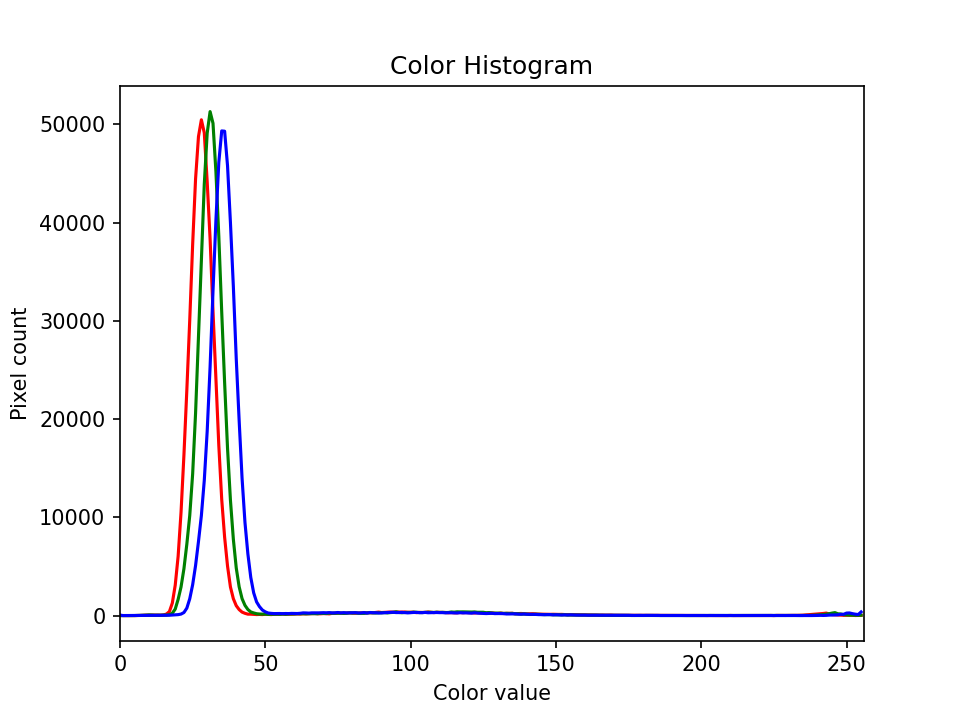
Finally we label our axes and display the histogram, shown here:
Exercise: Colour histogram with a mask (25 min)#
We can also apply a mask to the images we apply the colour histogram process to, in the same way we did for grayscale histograms. Consider this image of a well plate, where various chemical sensors have been applied to water and various concentrations of hydrochloric acid and sodium hydroxide:
# read the image
wellplate = iio.imread(uri="data/wellplate-02.tif")

# display the image
fig, ax = plt.subplots()
ax.imshow(wellplate)
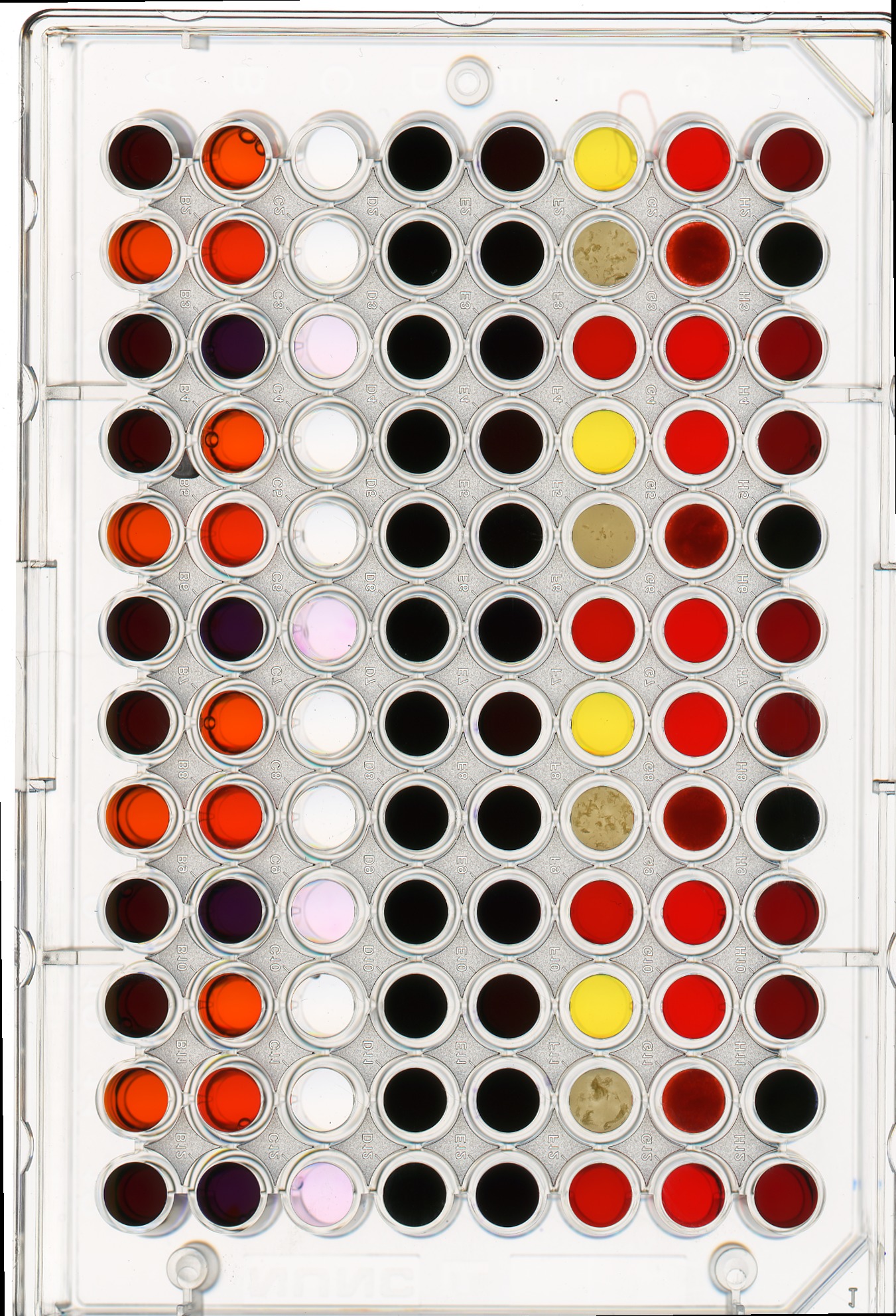
Suppose we are interested in the colour histogram of one of the sensors in the well plate image, specifically, the seventh well from the left in the topmost row, which shows Erythrosin B reacting with water.
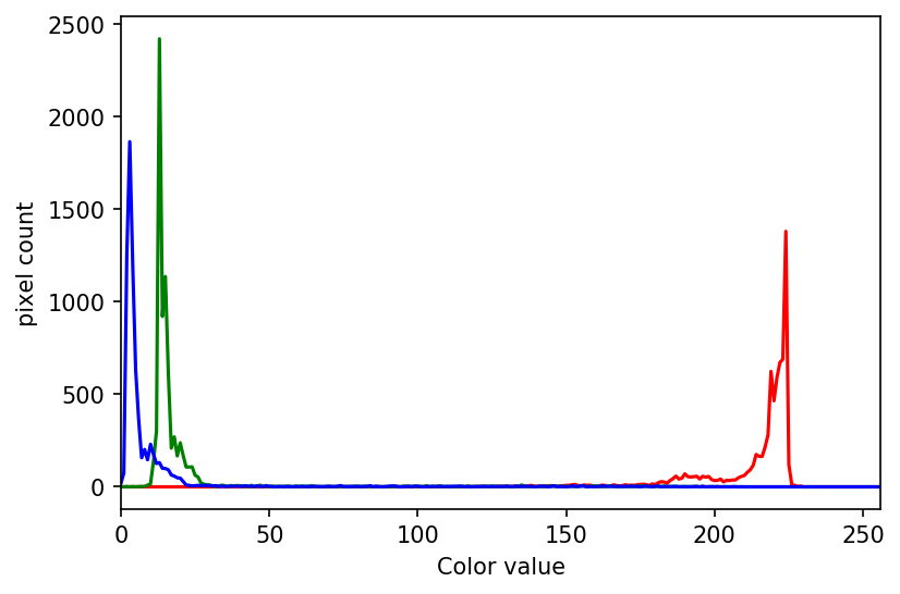
Hover over the image with your mouse to find the centre of that well and the radius (in pixels) of the well. Then create a circular mask to select only the desired well. Then, use that mask to apply the colour histogram operation to that well.
Your masked image should look like this:

And, the program should produce a colour histogram that looks like this:
Solution
# create a circular mask to select the 7th well in the first row
mask = np.zeros(shape=wellplate.shape[0:2], dtype="bool")
circle = ski.draw.disk(center=(240, 1053), radius=49, shape=wellplate.shape[0:2])
mask[circle] = 1

# just for display:
# make a copy of the image, call it masked_image, and
# zero values where mask is False
masked_img = np.array(wellplate)
masked_img[~mask] = 0

# create a new figure and display masked_img, to verify the
# validity of your mask
fig, ax = plt.subplots()
ax.imshow(masked_img)

# list to select colors of each channel line
colors = ("red", "green", "blue")

# create the histogram plot, with three lines, one for
# each color
fig, ax = plt.subplots()
ax.set_xlim([0, 256])
for (channel_id, color) in enumerate(colors):
    # use your circular mask to apply the histogram
    # operation to the 7th well of the first row
    histogram, bin_edges = np.histogram(
        wellplate[:, :, channel_id][mask], bins=256, range=(0, 256)
    )

    ax.plot(histogram, color=color)

ax.set_xlabel("color value")
ax.set_ylabel("pixel count")